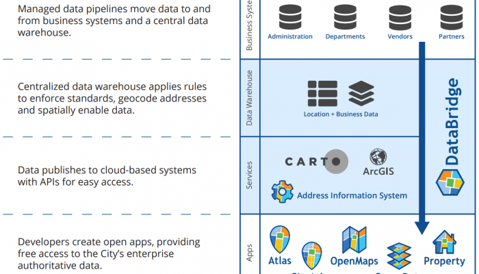
The Office of Innovation and Technology’s CityGeo team has created and publicly shared an interactive Open Data Dashboard visualization tool. You can use this dashboard to:
- explore the datasets that the City has recently released publicly;
- discover what datasets are in progress;
- look at overall performance metrics of the City’s open data program; and
- understand the use of the City’s open data across the globe.
Newly released dashboard at a glance
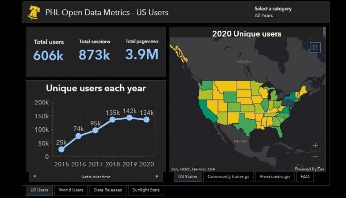
Philadelphia’s open data dashboard allows residents and users to track the City’s open data metrics. Some highlights from the visualizations on the dashboard show that:
- The City’s open data attracted over 600,000 unique visitors and more than 4 million pageviews since 2015. While the majority are from the United States, over 60,000 visitors are from countries around the world. Nearly every year, we’ve seen increased engagement by unique users with our open data.
- The City has publicly released 354 datasets, automated 77 of them for regular updates, and created 58 visualizations of the data we share.
- Of the 21 high-value datasets the former Sunlight Foundation recommended that all cities share publicly, the City has released 15, and automated 9.
Visualizing our own data
In early 2020, the City launched a survey to gather feedback on our open data work from residents and users. The results showed that people from diverse industries make meaningful use of our open data for professional, communal and personal goals. We learned that:
- academic researchers and urban planners use it to contribute to their fields of knowledge on a variety of social issues;
- professors and students include open data in their educational projects;
- nonprofits use it for program evaluation, grant writing, and service referrals;
- businesses incorporate City open data into the products they build;
- neighborhood leaders that use data to organize their communities around local issues;
- journalists use it for research and reporting; and
- individuals use it to learn about their homes or about Philadelphia in general.
The feedback we received through the survey let us know that users find it helpful when we create data visualizations to go along with the datasets that we publish, want more of the already released data kept up-to-date, and want easier ways to stay informed of new data releases.
We know that the open data we share is a key service that we provide to residents – and we want to make sure it’s accessible and reliable. We’re using this feedback to drive our internal work. By publishing this dashboard, we hope it makes it easier to follow what new releases we’ve published and what data has received a recent refresh.
Users can filter by release year, department, or can search for specific datasets. The dashboard also includes FAQ tabs on charts to explain key terms. It presents information through graphs and visualizations of the data—and even maps—offering users the opportunity to more easily explore the data.
This dashboard was created for the public so they can continue to see how the City’s data work evolves and moves forward. Transparency and access are at the heart of Philadelphia’s open data work. You can share feedback about this dashboard by emailing maps@phila.gov.